Zocdoc Lightning Booking
How we achieved the first booking conversion increase in 5+ years
The Challenge
Zocdoc’s booking flow had been notoriously difficult to improve. Despite years of experiments and iterations, no team had successfully increased conversion rates. But since it was a critical part of the Zocdoc experience, our newly-formed team was tasked with taking another shot.
Our Process
Research-First Approach
We started by deeply understanding the existing flow through user research, analytics, and competitive analysis.
Collaborative Design
We did a lot of ideation with the whole team—design, product, and engineering. We made several interactive prototypes and tested with users throughout the process.
Rigorous Testing
Before launch, we conducted extensive A/B testing to ensure our improvements would actually move the needle.
Our Approach
We focused on two key strategies to improve the booking experience:
Making the process faster and easier by eliminating unnecessary steps and simplifying the interface.
Helping users understand what's happening and why their information is needed at each step.
Reducing Friction
Fewer pages
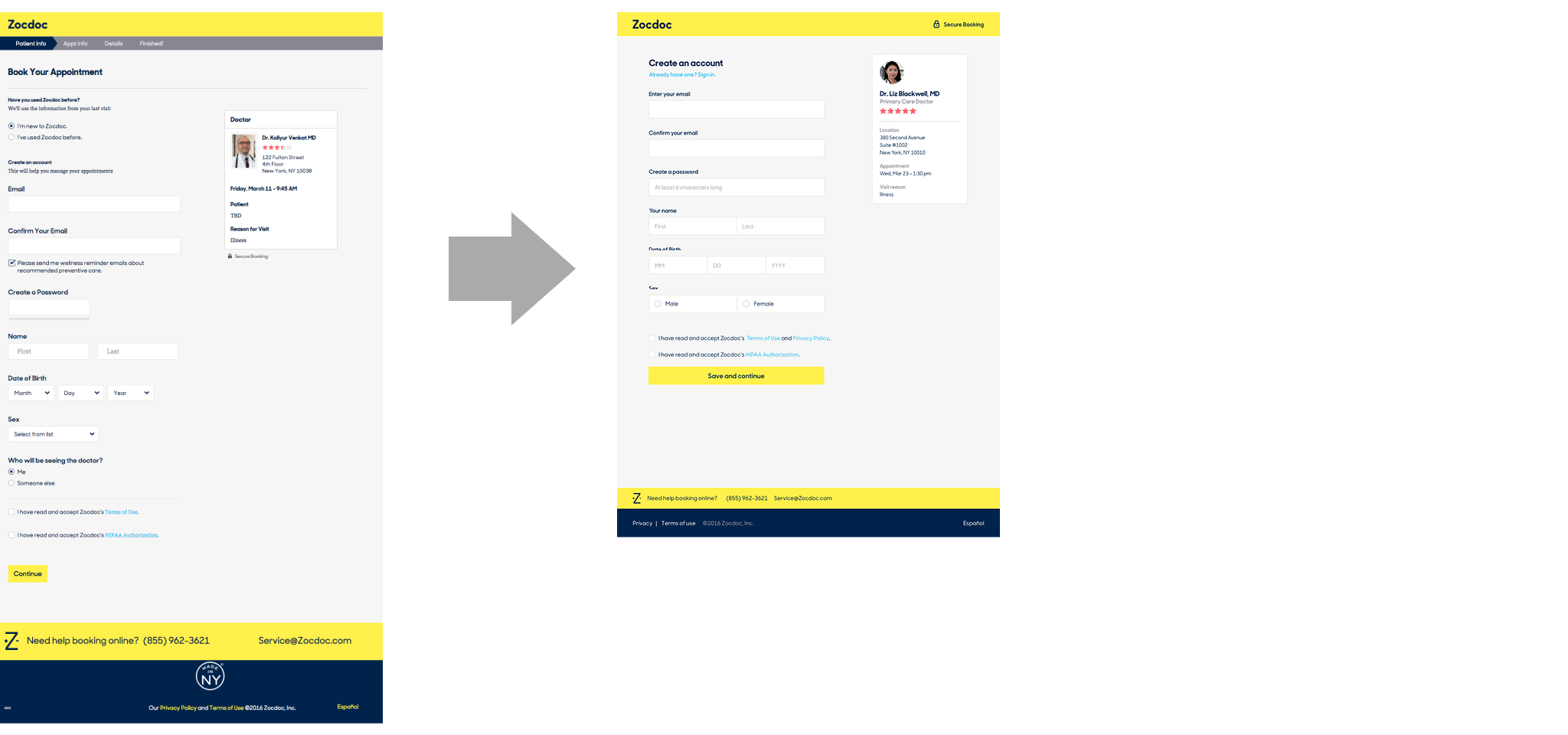
We changed the flow from a wizard to a single page experience for signed-in users. And for users creating an account, account creation was a single page. This was then followed by the single booking page. Editing info—which wasn’t done often—happened in pop-ups. This kept all the related interactions on the same page.
Shorter & simpler pages
We simplified a lot of visual clutter and reduced interaction costs like clicks. This led to a more streamlined visual and easier-to-use page.
Familiar patterns
We made the booking page more of a summary view—closer to e-commerce checkout. This was heavily influenced by Amazon’s checkout experience. This made the page more usable by using a familiar, predictable pattern.
Updated visual design
Zocdoc had recently refreshed their brand. The booking flow wasn’t yet in line with the new updates. We took the opportunity to fix this. This brought the booking flow more in line with the rest of the experience on Zocdoc.
Building Trust
Clear account creation
Most of the users entering the booking flow need to create an account. In the old flow, it wasn’t clear enough that you were creating a Zocdoc account. This made it unclear why that info was needed. The new flow made account creation an explicit call-to-action. So, users were more clear what they were doing and why.
Transparent phone verification
As part of the booking process, users verify their phone number with a 4-digit code. In the old flow, there was no explanation why until after the process was complete. This caused lots of dropoff as people are often hesitant to share personal info—especially if they’re not clear how it will be used. The new flow made it clear the phone number was for the doctor to contact you. So, fewer people hesitated
Results: Breaking the 5-Year Drought
After months of research, design, and testing, we finally achieved what no team had done in over 5 years: a 1.5% increase in booking conversion. While 1.5% might sound modest, it represented a substantial increase in successful bookings for a platform serving millions of users.
Prototypes
Key Learnings
This project reinforced some core beliefs about successful design work:
- User research is essential: Understanding the “why” behind user behavior led to better solutions
- Collaboration drives innovation: Great ideas came from across the team, not just design
- Small improvements compound: Each optimization contributed to the overall success


