
My White Whale: The Zocdoc Insurance Picker
You all know that Ahab had his white whale—Moby Dick. I had a different white whale: the Zocdoc insurance picker.
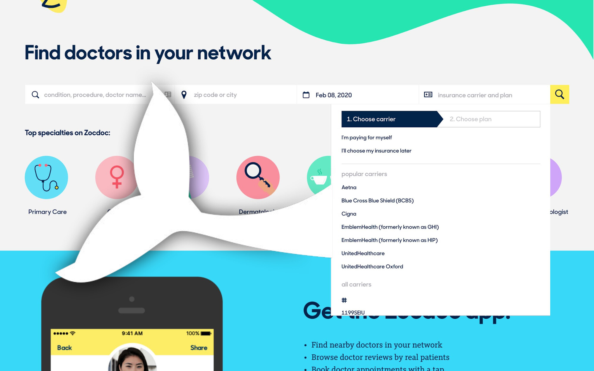
When you search on Zocdoc, you enter three main criteria: a search query, your location, and your insurance. It was my first project at Zocdoc, and was only partially successful. I continued to try to improve the insurance experience throughout the rest of my career at Zocdoc. This insurance picker haunted me.
Why I was excited
As a first project, this seemed like the perfect project for me. Insurance is obviously valuable—for most people, going to an in-network doctor is critical. And finding in-network doctors is one of Zocdoc’s main value props and a real differentiator. But I also loved that the problem was complex.
I love complex problems—especially when you can take something complex and make it simple for lots of people to use. It’s part of why I love being a product designer. I’d been told this was a pesky problem at Zocdoc—they’d tried many variations but never made one that really worked well. I was eager to prove myself.
Here’s the thing: I dramatically underestimated the complexity.
The challenge
Working with PM Aashima and engineer Andrew, we had 4 weeks and these constraints:
- Must be responsive (Zocdoc was maintaining separate desktop and mobile pickers)
- No touching the underlying data (no resources to fix Zocdoc’s messy insurance data)
- Must make it clear to select carrier and plan (data showed people picking carrier but not plan)
- Must start from free-text search (vision for entire search to be free text)
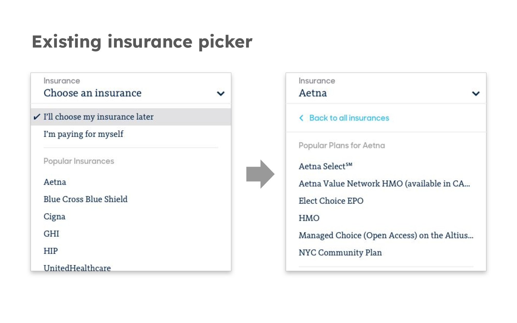
The existing picker was a 2-step dropdown, but Zocdoc had just launched a free-text search field powered by machine learning for specialties. The vision was for insurance to be free-text as well, so the whole search experience could be free-text.
The messy reality
But when we dug into the data, I found it was much messier than expected:
- 500+ carriers and 7,000+ plans
- Overlapping names—plan names were similar, some carriers had plan names similar to other carriers, and some plans even had other carriers in their names
- Sloppy data—inconsistent abbreviations, repeated carrier names, various aliases
This led Aashima and me to suspect pure free-text search wouldn’t work. I built an HTML/Javascript prototype that confirmed this. There were so many plans with similar names, you had to practically type in all of the carrier and plan to get a match. Plus, most people don’t know their plan name in the first place.
We realized we needed a browse experience alongside search, since recognition is generally easier than recall.
The insurance complexity problem
Insurance is uniquely complex:
- Incomplete mental models—Patients know their carrier but rarely their plan
- Constant change—New plans every year, employers renegotiate
- No source of truth—No one tracks new plans or which doctors accept them
- No standards—Every company does things differently
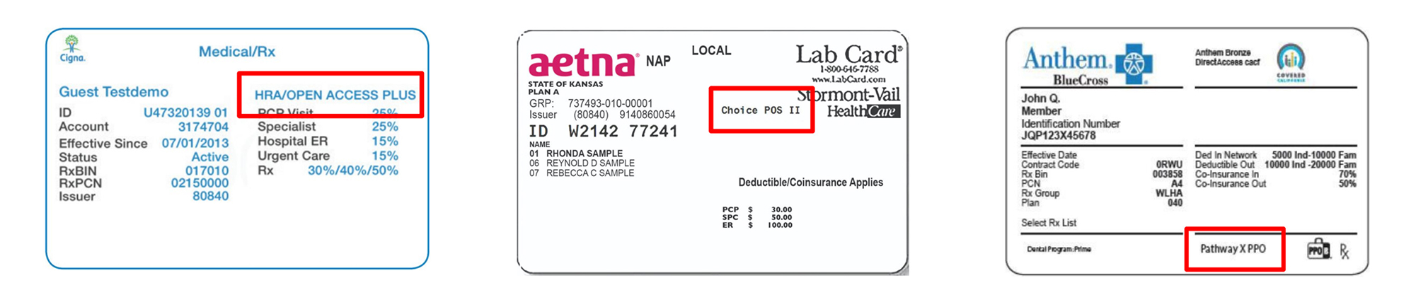
- Plan names are hard to find—Plan names are buried and inconsistent and inconsistent on insurance cards
First attempt: Not quite there
After sketching, prototyping, and user testing, we launched our first version. The results weren’t great—people were filling out plan information less than before, and overall conversion was down.
We found bugs, fixed them, and launched again. Better, but still down. We got FullStory added to the part of the site we were working on and could see real user sessions. This revealed specific issues around editing insurance and Blue Cross Blue Shield edge cases.
We made some more changes and launched again, and this time it was…completely flat.

Stakeholders said flat was good enough since it accomplished the free-text goal. But I was bummed. It felt like the whale had won.
Second attempt: Small wins
After a reorg, the picker got a new owner, but sadly on a different team. Fortunately it was with the engineer Avi, who was equally passionate about insurance. We decided to work together anyway. Since the insurance picker wasn’t prioritized for Avi’s team, we used a Hackathon to prototype new ideas and got executive attention. This led to another sprint focused on a smaller, confident win: getting more people to complete plan selection.
This test was slightly up—we lifted plan completion but didn’t see the overall conversion lift we hoped for. The issue? Not enough people were opening the picker in the first place.
What I learned
After much discussion, reflection, and analysis, we decided the main issues were:
- Wrong place—More traffic comes to doctor profile pages from Google, not the homepage
- Recognition > recall—Browsing with insurance logos works better than search
- Power curve—A small number of carriers/plans make up most bookings in any area
- Dropdown limitations—Limits space and entry points
- Need for guidance—Patients are confused and need help
My proposed solution
Instead of a grouping insurance with the booking controls where it had normally been, I proposed:
- Pulling carrier selection onto the main page using recognizable logos
- Opening a pop up screen for the complex tax of insurance selection
- Creating more room for guidance
- Simplify the flow for the 80% of patients with common plans
The outcome
I left Zocdoc before conquering the insurance picker. Since then, they’ve added logos and tested popup versions similar to our proposals. The picker remains largely the same, but I hope those small changes improved the experience and helped more patients get care without insurance surprises.
Not every project gets a perfect ending, but this one shaped how I approach complex problems.